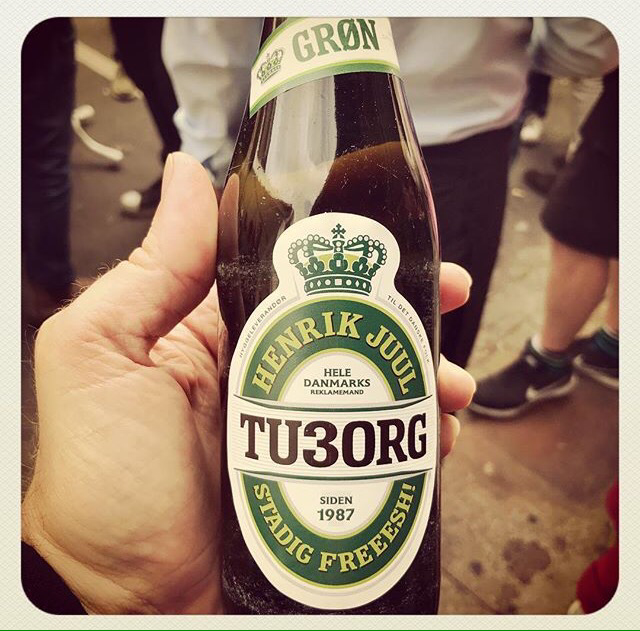
It is so rare and I get so happy, when occasionally an efficient communication campaign manages to connect the dots of communicating the message by capitalizing on the branding.
The 30 years anniversary of Tuborg is one of those rare examples! Not just because it is cleverly integrated in the verbal identity and word mark, but because it is so clever that it makes you smile. It’s definitely not obvious, as you have to look twice, but it is just so well done.
Ok, also because it is Danish, has the name of the creative director on the label and is about beer, but that is just between me and my audience.